Art has a profound impact on our mental and emotional well-being. One of the most significant aspects of this influence is color. The psychology of color explores how different hues affect our mood, emotions, and overall atmosphere. Artists have long used color to evoke specific feelings and responses in their viewers. This article delves into the effects of various colors in art and how they shape our psychological state.
The Power of Color in Art
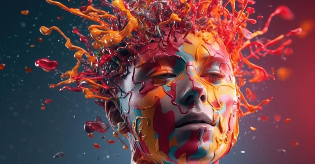
Colors are not just visual stimuli; they carry emotional weight and cultural significance. When artists choose their palette, they are not merely selecting shades—they are crafting experiences. The right combination of colors can transform a simple painting into an evocative masterpiece that resonates on a deep, emotional level.
Warm Colors: Energizing and Stimulating
Warm colors like red, orange, and yellow are known for their energizing and stimulating effects. These colors can evoke feelings of warmth, excitement, and passion. Red, for instance, is often associated with love, intensity, and even anger. It can increase heart rate and create a sense of urgency. This is why red is commonly used in marketing and advertising to grab attention and invoke strong reactions.
Orange, a blend of red and yellow, carries similar energetic qualities but with a touch of playfulness and warmth. It is often associated with enthusiasm, creativity, and success. Yellow, the brightest of the warm colors, is linked to happiness, optimism, and sunshine. It can uplift moods and inspire feelings of joy and cheerfulness.
Cool Colors: Calming and Soothing
In contrast to warm colors, cool colors like blue, green, and purple have calming and soothing effects. Blue, reminiscent of the sky and sea, is associated with tranquility, trust, and stability. It can lower blood pressure and slow down the heart rate, making it an ideal color for creating a serene and relaxing atmosphere. This is why blue is often used in bedrooms and spaces designed for relaxation.
Green, the color of nature, symbolizes growth, harmony, and freshness. It has a balancing effect and is believed to have a calming influence on the mind and body. Green is frequently used in spaces where a sense of balance and rejuvenation is desired, such as in hospitals and wellness centers.
Purple, a combination of blue and red, carries the calming properties of blue with the intensity of red. It is often associated with luxury, spirituality, and creativity. Lighter shades of purple, such as lavender, can bring about a sense of peace and calm, while darker shades like royal purple evoke a sense of mystery and sophistication.
Neutral Colors: Balance and Versatility
Neutral colors like black, white, gray, and brown serve as the backbone of many art pieces. They provide balance and versatility, allowing other colors to stand out. Black, while often associated with power, elegance, and mystery, can also evoke feelings of sadness or fear. It is a color that commands attention and adds depth to an artwork.
White symbolizes purity, simplicity, and innocence. It can create a sense of space and openness, making it a popular choice in modern and minimalist art. Gray, a blend of black and white, represents neutrality and sophistication. It can be calming and balanced but can also convey a sense of ambiguity or indecisiveness.
Brown, the color of the earth, is associated with stability, reliability, and warmth. It brings a sense of grounding and comfort, often used in artworks that aim to evoke a connection to nature and the physical world.
The Cultural Context of Color
The psychological impact of color is not universal; it is influenced by cultural contexts and personal experiences. For example, while white is associated with purity in Western cultures, it is a color of mourning in some Eastern cultures. Similarly, red can symbolize good luck and prosperity in China, while it may represent danger or caution in other parts of the world.
Artists often take these cultural significances into account when creating their works. Understanding the cultural context of color can enhance the emotional and psychological impact of an artwork, making it resonate more deeply with diverse audiences.
Using Color to Enhance Emotional Well-being
Artists and designers can harness the power of color to create environments that enhance emotional well-being. Whether through paintings, photo prints, or interior design, the strategic use of color can transform a space and influence the mood of its inhabitants. For example, incorporating calming blues and greens in a bedroom can promote relaxation and restful sleep. In contrast, using vibrant reds and oranges in a living room can energize the space and stimulate conversation and activity.
When selecting photo prints for your home or office, consider the emotional impact of the colors in the artwork. A carefully chosen piece can not only enhance the aesthetic appeal of a space but also contribute to a positive and uplifting atmosphere.
Conclusion
The psychology of color in art is a fascinating field that underscores the profound impact colors have on our emotions and well-being. By understanding how different colors affect our mood and atmosphere, we can make more informed choices in art and design. Whether you are an artist, a collector, or simply someone who appreciates beauty, paying attention to the colors around you can enrich your experience and enhance your emotional and mental health.
For those looking to bring this understanding into their own spaces, exploring a variety of photo prints can be a wonderful way to start. These prints allow you to incorporate the powerful effects of color into your environment, creating a space that not only looks beautiful but also feels harmonious and inspiring.


1 thought on “The Psychology of Color: How Art Shapes Mood and Atmosphere”